【Open Source】Mendix Ecosystem Expansion: Native Button Component Encapsulation Based on Ant Design
Background
While helping numerous large enterprises with Mendix low-code development, we found that Mendix's native Button component often falls short when facing complex B2B business scenarios. For example: lacking rich state expressions (such as ghost buttons, danger operation buttons), lacking fine-grained size control, and lacking distinct visual hierarchies when building high-density data platforms.
To allow Mendix developers to focus more on business logic rather than spending a lot of time adjusting UI styles, the Mindrose team (as core contributors to the Mendix-Antd open-source project) decided to introduce the industry-recognized excellent enterprise-level UI library Ant Design into the Mendix ecosystem.
The Challenge
- Ecosystem Isolation: Mendix has its own closed Widget system. How to seamlessly bridge complex Antd components from the React ecosystem into Mendix Pluggable Widgets is a major challenge.
- Property Mapping: Need to convert Antd Button's rich APIs (Type, Shape, Size, Danger, etc.) into graphical properties that are easy for business developers to understand and configure in Mendix Studio Pro.
- Event Binding: Must ensure that the component not only looks consistent but also perfectly responds to Mendix's Action trigger mechanism (such as executing Microflow, Nanoflow, or opening a page).
Our Solution
Based on the Mendix Pluggable Widget API and React, we deeply encapsulated the Mx Antd Button component.
1. Comprehensive Visual and Interaction Mapping
We completely opened the core capabilities of Ant Design Button to Mendix developers:
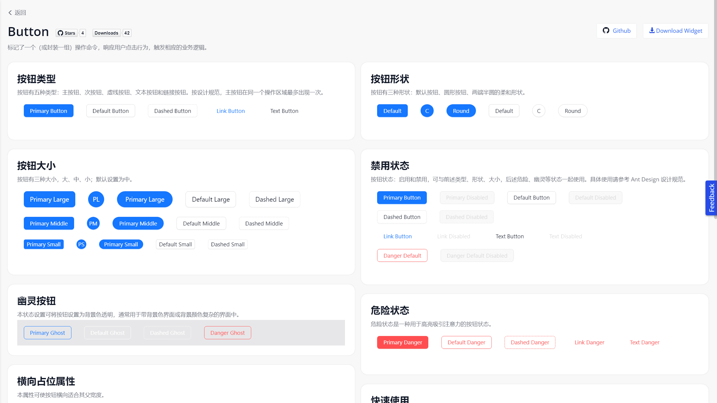
- 5 Core Types: Primary, Default, Dashed, Text, Link, helping developers easily build primary and secondary visual hierarchies on pages.
- 3 State Modifiers: Danger (warning for dangerous operations), Ghost (ghost button, adapting to complex backgrounds), Disabled (disabled state).
- Shape Control: Supports Large/Middle/Small sizes, as well as Default, Circle, Round, and Block (full width) shapes.
2. Ultimate Developer Experience (DX)
In Mendix Studio Pro, we designed an extremely intuitive configuration panel (Property panel) for this component. Developers only need to select through simple dropdown boxes to complete the button style configuration and bind it to any Mendix OnClick event.
Open Source Impact
As part of the Mendix-Antd open-source initiative, this component greatly enriches the UI ecosystem of the Mendix community:
- Development Efficiency Boost: Frontend style adjustment time reduced by 80%, developers no longer need to write cumbersome custom CSS (Sass).
- Enterprise-Level UI Quality: Instantly equips Mendix applications with a premium texture comparable to modern hand-coded frontend projects.
- Community Contribution: The project is open-sourced on GitHub and provides a complete online Demo environment for global Mendix developers to use and customize for free.
Try it out
Online Demo: Mendix Antd Widget Demo
Source Code (GitHub): GavinCnod/mendix-antd-button
Installation Guide
- Download the
.mpkfile from GitHub Release. - Place it in your Mendix project directory
{YourMendixProjectFolder}/widgets/. - Synchronize the project in Studio Pro, and you can drag and drop the
Antd Buttonfrom the toolbox.